About Changemaker The minimalists, Joshua & Ryan, help millions of people learn to live better…
Brand identity is an important part of a product/service/company visual communication-led branding strategy, and it can help fuel viral marketing campaigns.
I’m an experienced brand consultant today, but I started out years ago as a graphic designer designing aesthetic logo identities. I haven’t included old idents within my site portfolio but I have included ones of more recent years which were part of a developed brand identity.
It’s something I still do today. I love coming up with new, clever, and effective brand identities.
Behind every brand identity, there’s a story, a challenge, an aim, and an outcome.
Some were created simply as a standalone logo to fit a client’s idea, some were developed as part of a much larger branding campaign, whilst nearly all were ideated and developed by myself from scratch, often without a brief of what the client really wanted. I was given a blank canvas in terms of the visual identity but a framework in terms of the branding aim.
Although it’s fair to say I have a ‘style’ in my ident work, I always try to stay flexible and not typecast myself to one specific industry or format, and so I’ve gained experience creating brand identities across a range of industries.
The Brand Identity Process
Following an initial consultation and picking up the target of the brief, with each project I will likely start out with sketches to feed ideas and let creativity wander (before wireframing), whilst always trying to match it to a brand vision that aligns with the brief.
If the job requires brand consulting then I will liaise with the client and help them develop their brand strategy and identity.
Here are some typical sketches that I’d get started with. Sometimes, the best ideas present themselves first, other times, it takes more probing:
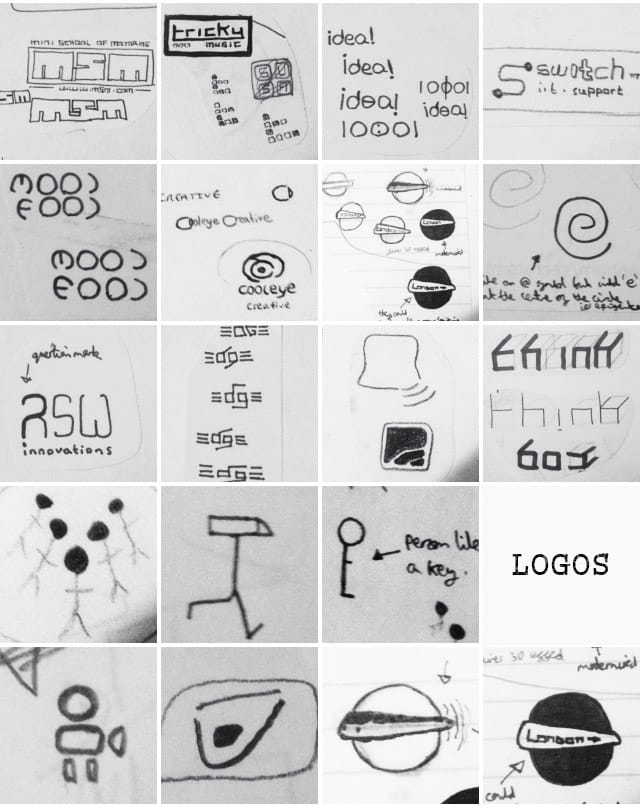

Following the initial stages of idea generation as part of a brand identity project, I’d generally start focusing in after giving a few variants to ponder, then lead to wireframing before creating a full vector-based project file once the client is satisfied.
Each project requires a different focus and a different amount of research. I usually give clients a ‘service’ checklist to help them define the types of work they require from me, from a simple logo to a fully-fledged branding, UX, and/or innovation package that helps you figure out where you want to go, stand out from the crowd, deliver great experience and interaction with your customers/users, and consider the forward-thinking sustainability aspects of your brand.
What’s the price for brand identity work?
A lot of thought space always goes into my projects. I don’t just come up with a half-arsed logo identity that just pleases aesthetics but has no focus on your brand values or identity standpoint. Even if you just want a simple logo I will still ensure it fits your desired direction, credibility, and desirability.
For this reason, my services aren’t like the cheap logo idents you’ll find in places like Upwork. I know my value and what I can bring to the table is often a unique blend of creative vision, technical skills, and logical reasoning.
It’s hard to price a project upfront and it will generally require an upfront consultation to gain a greater idea of your needs and the resulting costs. Some projects will work out best for both the client and myself on an hourly rate (which is at least £50 an hour depending on the project), others will be on a project basis, and others a variation.
Feel free to look into the case studies and brand identity work from Richly UXD, or contact me directly. Here’s a selection of graphic identity and branding work I’ve done for clients in recent years.
NOTE: All idents are published as lower quality images and not full vector quality, for web and copyright reasons.
Mini School Of Motoring (Brand Identity)


Originally, my client wanted an improved identity that had the silhouette look of a mini car. Their initial identity had a car silhouette with their company name within the silhouette. They came to me seeking a simplified version, but also wanted their identity to be recognisable as being part of a driving school, and not come across as a car dealership selling minis.
The challenge was to develop an identity that would be simple and potentially lead out easily into branding campaigns, and the result I ideated was a block-like logo that looks like car park spaces (or driving school obstructions) from a plan view.
For this particular project, I was briefed as a brand consultant to help take the identity and devise a fresh approach in my client’s branding materials that would help people recognise them as being a driving school. The concept led to initial ideas for driving blocks (packages) that made it easier for the students to learn in their limited free time. With the ‘blocks’ element the aim was to complete blocks when and as they could, with each block having a specific driving lessons focus.
Mr Locksmith (Brand Identity & Company Name)

What started as a fictitious name that was used as a placeholder whilst playing around with initial identity variants turned out to be a rebranded company name and identity.
The client initially wanted a logo ident that would stand out from the usual ‘keys’ logos locksmiths normally file under. He wanted to break the convention of the old ‘est’ dates and ‘times new roman’ like fonts that aimed to show trust and longevity, and come across as more approachable and ‘laid back’ as he put it.
He required something that would appeal to the modern younger crowd, yet be refreshing to an older one. The client was a freelancer without a huge amount of years in the industry compared to others so seeking to stand for longevity wouldn’t really fit, so we adopted a fresh approach.
I created a fresh and simple-looking key that is in the shape of a person. I then carried it further with a brand name that would give him credibility as being fun and trusting, and easy way for people to relate to him.
I probably took it a step too far in one of the initial ident variations and made the ‘keyman’ laid back onto a wall (‘locksmith’ word) and cushion (‘mr’ word), but he liked it and it stuck, as did the same.
In terms of branding, the name worked, with an easy-to-remember name that covered his job title key word.
Mother Goods (Brand Identity)

The client wanted an identity that would demonstrate caring goods mothers buy for their children. The focus was more on younger children who are dependent but the idea was also to be ‘good mothers’ who can have access to programs that help them find more time and connection to their kids in a busy and expecting world.
The client wanted a simple ident that could be easily used as a sticker for branding purposes, like stars you give kids when they do their homework, the idea is that mothers deserve praise too for when they are both working and looking after kids. It’s also like a pamper package for mothers, in physical products, and in relaxing retreats, so I came up with a logo that looks like a basket, with the ‘goods’ in the basket, and ‘mother’ effecting holding the handle of the basket at the top half. The colours chosen were meant to create a feeling of calm and subtle warmth.
Adapteco (Brand Identity, Name & Concept Proposal)
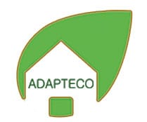

Adapteco was a large project. It was for a company in Australia that was seeking to develop forward-thinking, sustainable premium apartments. My role as an in-house freelancer at partner company Greening Australia was to original help with landscaping initiatives, but after a talk with a partner client of theirs, Warrina, it led towards this innovative concept project (and fueled the way for me to be more sustainable and innovation-focused thereafter).
Australia isn’t known for its environmentally-focused ways so Greening Australia (primarily a tree planting company) proposed an initiative to seek sustainable living concepts for a variety of different dwellings.
This included sustainable premium apartments, budget accommodation, and hybrid movable accommodation, all with the focus on creating a greener future.
This led to developing a housing name for this partnership initiative between Warrina and Greening Australia, and I came up with Adapteco (meaning adaptable, eco-friendly, sustainable).
The identity logo hopefully speaks for itself. Taking inspiration from the Greening Australia company I stuck with nature. The logo is a leaf on an angle rooted to the ground by an eco-friendly house (thus keeping attached to its roots and green image, rather than the tree losing its colour and wilting after breaking from it). It’s also like a green rocket tilting and setting off into the future.
This job led to a concept development project where I was to be a part of a team developing some 3D-plan concepts on how a sustainable premium apartment block of the future could function. There’s more on the Adapteco innovation concept here.
Channel 4 (More 4 Alternative Pre-Ident)


I was debilitating over whether to put this one in here or not as it is actually from over 15 years ago (yes, you heard that right). The reason I decided to was that it’s a story left untold. I never actually gained a client for this work, as it was commissioned as a university project, one which led towards a final year module where there was a brief by Channel 4 to come up with an alternative logo for an extra channel they were going to launch.
Many of us on the course thought it was a typical fake brief that is common in uni, but as I would find out the hard way afterward, it wasn’t. The ‘More 4’ channel logo was basically a slightly edited (yet almost direct) copy of the variants I created, and I was only to find out after leaving university.
I let it slide as it was a university project but I did create an original ident before a variant of it that would go on to be the framework on some ident work seen on More 4.
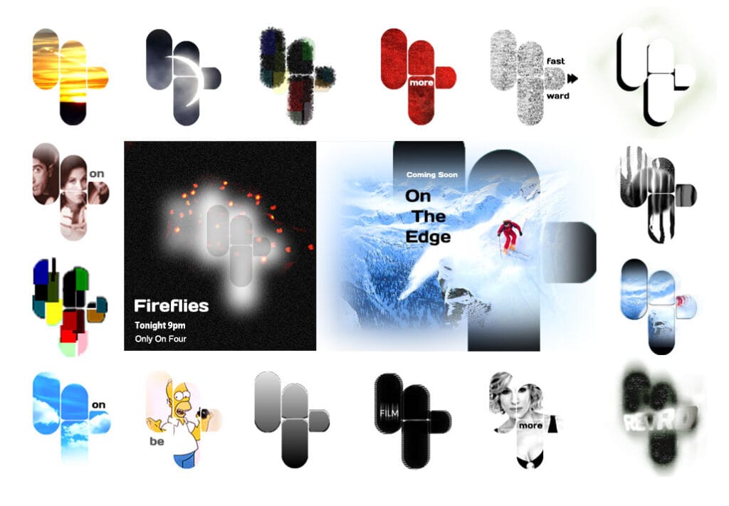
The idea behind it was about having 4 parts that make up the 4 logo, plus for it to act as a window to see through. Today, this might not seem like much, more, if not all, idents on channels use see-through idents to create window effects, but at the time it was a pretty unique idea (one that someone felt was worthy of taking).
The final idea behind this was about creating ‘energy bars’ that would change like sound waves, but you’d have to see a moving ident to see that (which I don’t have the format for anymore).
Here’s a selection of a few other variants that were created (to show how brand identity can be extended through the use of layers and windows):

Tidbit Popup Performances (Brand Identity)

Tidbit was a project commissioned whilst living recently in South Korea.
This brand identity was created for a small startup that wanted to put on ‘bite-sized pop-up performances’ (live interactive theatre plays) in and around Seoul. What attracted me to the project was the interactive element within this young startup.
I was asked to create something that would ‘paint a picture that was there one minute, gone the next’.
I created quite a few idents around the concept of plays, performance, even book scripts, but the client liked the idea of a paintbrush being ‘nearly’ finished and easy to remove after (i.e. pop-up). The name Tidbit means small, bite-sized pieces (or short performances). The logo reflects this through part of the ‘bit’ ending of ‘tidbit’ being bitten off.
Stellar Academy (Brand Identity, Name & Materials)

This project was also in South Korea and was for a school academy program in Seoul.
The academy wanted to attract more people to its learning library, called Playbook. It was mainly aimed at 10-15-year-olds for after-school language learning. A part of their aim was to get people reading cross-language books from their integrated reading library whilst ensuring that it didn’t feel as monotonous as many other lessons children that age had throughout the day.
However, there was another issue that arose shortly after going ahead and creating a Playbook identity. The principal of the academy was thinking about a name change for a while. She had taken over from a previous principal and wanted to rebrand their academy, so the job became a rebranding one first.
The client wanted something that would coordinate with the rainbow book learning colour system that was in place, and which would be playful yet show growth.
The end result was the name Stellar, to signify becoming ‘shooting stars’ who learn quickly, as well as stellar meaning excellence. The star idea was then brought through into a rainbow formation and colour scheme that connected Stellar Academy to Playbook.
The client asked me to return and help them with their print materials too, to carry the brand through.
Voices Of The People (Brand Identity)
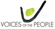

Voices of the People is a ‘video testimonial’ market research company. As part of a very open-ended identity brief, I had to create a simplistic logo that would be fresh and engaging.
I came up with an ident that says both ‘voices’ and ‘people’. It’s a changeable logo a bit like if you gave someone a picture of a witch and asked them if it was old or young when it actually has both in the same photo. If you look at it one way then it’s a mouth and chin, ‘the voice’, if you look at it another way then it’s a head and arm up in the air like they are celebrating ‘the people’.
It’s meant to show the idea of having the freedom to have your voice, your say, your opinion, to give a video testimonial or a review on something.
I have worked on many more brand idents over the years across many different industries. Whatever your brand identity needs I can be confident my unique skillset of creative vision, technical skills, and logical reasoning can help you find the answer your brand needs for today and forward-thinking ahead into brands needs tomorrow.
Contact me today here, or browse Richly UXD services here.
A Case Study From:


